
I know choosing colours for UI design is a crucial aspect, as it directly impacts the user’s experience and perception. This process can be time consuming, so it’s best to have a step-by-step process you can follow for each project, otherwise it’s easy to get lost.
Understanding colour psychology
Different colours evoke different emotions. For example, blue is often associated with trust and calmness, while red can convey energy or urgency. Consider the emotional response you want to evoke, and choose colours accordingly.
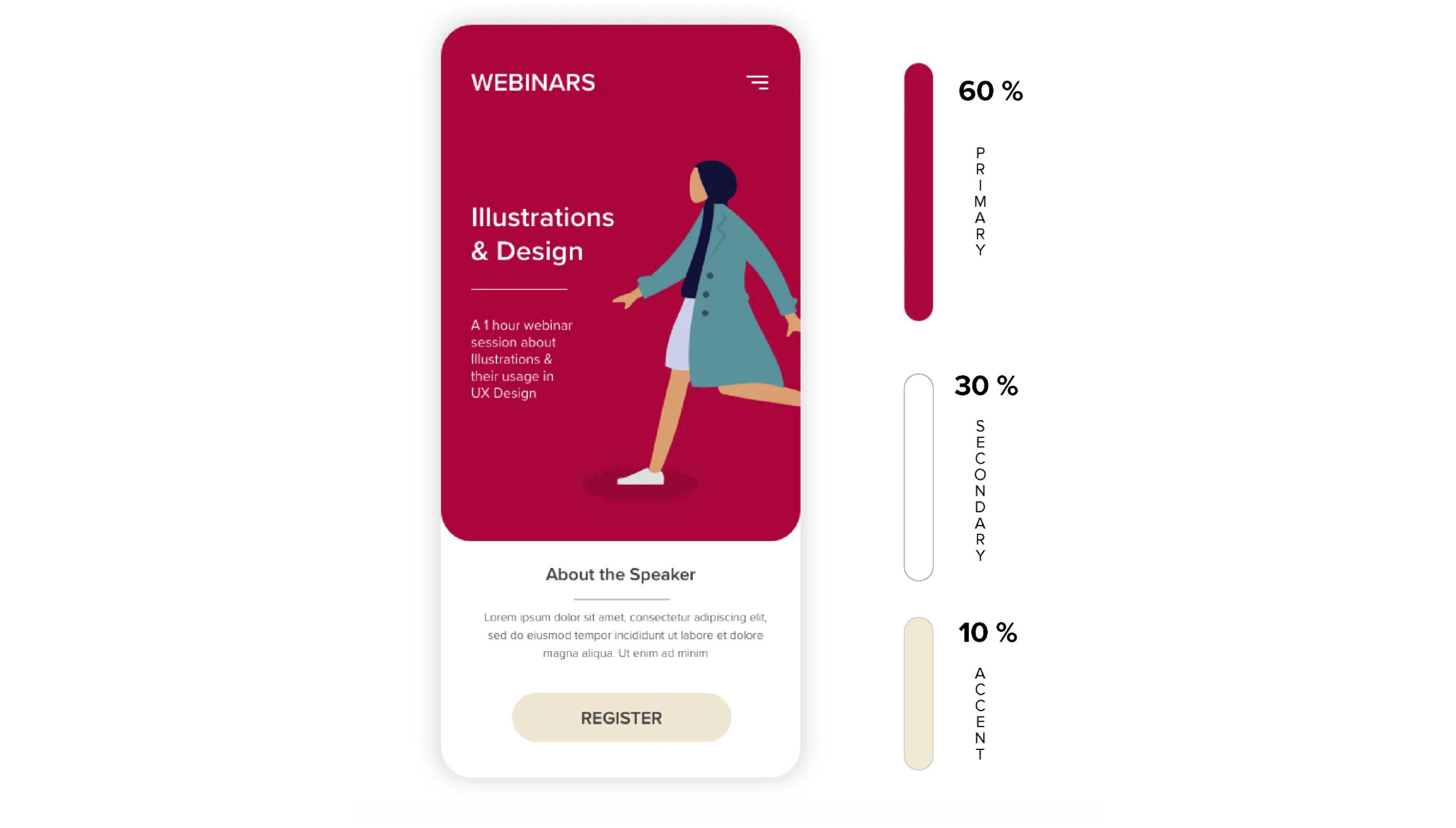
60-30-10 rule
The 60-30-10 rule is a commonly used principle in interior design and graphic design, including UI. Applying the 60-30-10 rule helps create a visually balanced and harmonious design by providing a structured approach to colour distribution. It prevents the overuse of certain colours, ensuring that the design is both aesthetically pleasing and functional. You don’t need to follow this strictly, but can use it as a guideline. Some specific needs of a project may lead you to adjust some proportions.
Colour accessibility
Prior to joining Spicerack I worked for a digital health startup. They develop home-monitoring apps for measuring vision. The users live with various eye conditions such as macular degeneration, Amblyopia and diabetic-related ones. Talking with the users on a daily basis and hearing their daily struggles, I knew I had an important part to play in how they could see information used throughout the product with careful colour choice. To make sure a colour palette is accessible, I use some of the contrast checkers and design element accessibility checkers like WebAIM, noCoffee-and Accessibility Scanner.
Study design systems
It’s great practice to study how colours have been used in design systems by other companies. Then you can really understand how colours are used across various elements and components. Studying these design systems helps you gain a better understanding on how many colours you should choose for your primary, secondary, neutrals and semantic.
It really is true that colour plays a huge part in the success of your digital product. Designers should take pride in that responsibility and how the colours we choose affect how people feel when using a product. So take your time with it and choose wisely.
Here are some of my go-to sources:
Design systems:
Possible images created with midjourney: